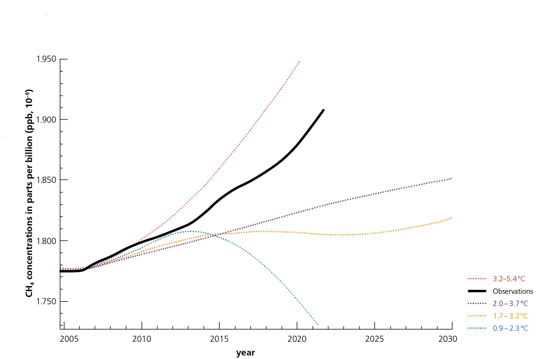
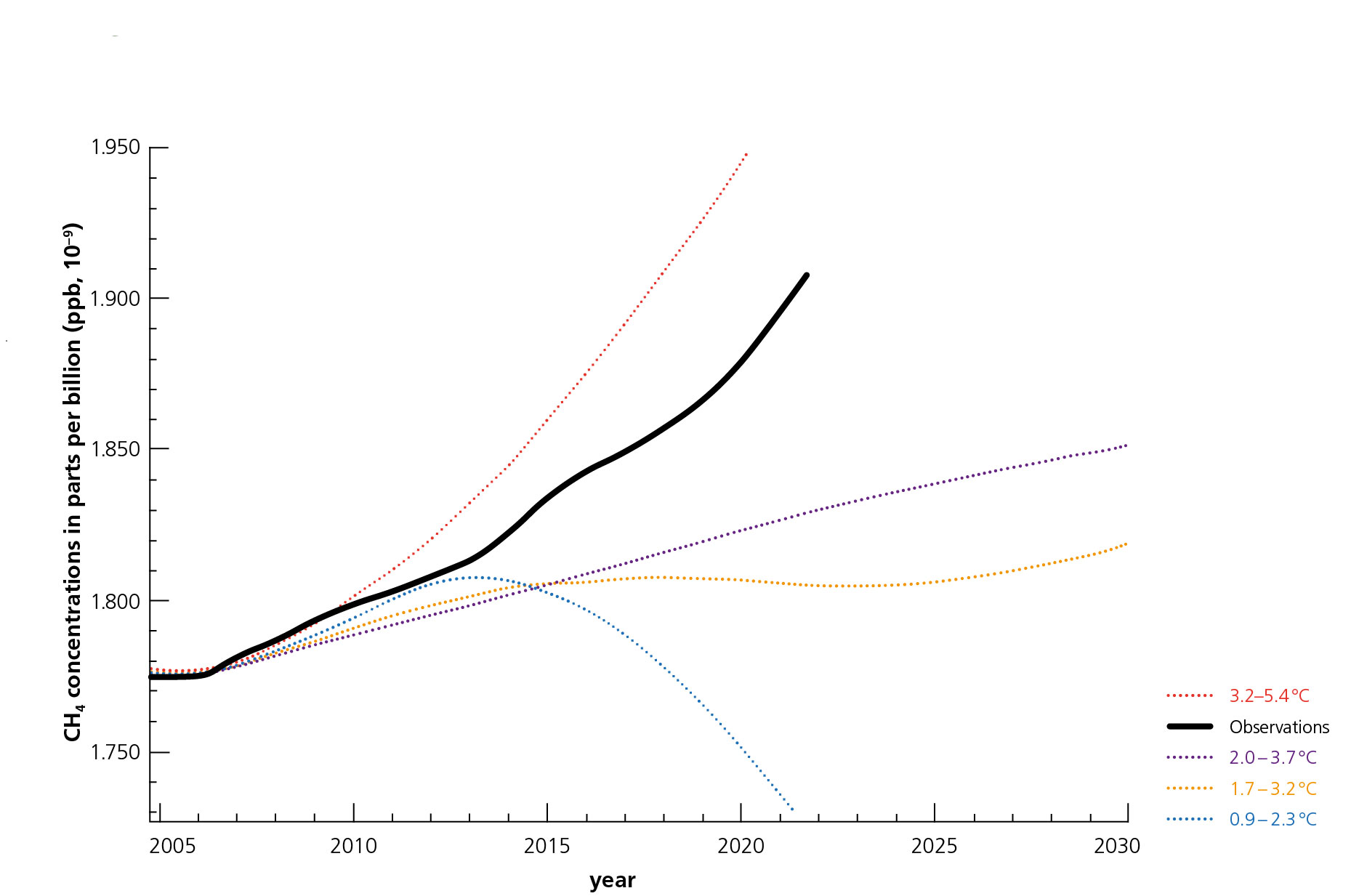
Observed methane concentrations compared to the IPCC future scenarios

Observed methane concentrations compared to the IPCC future scenarios
The black curve shows observed methane emissions through the years. It is clear that methane concentrations have been rising faster since 2014. The coloured curves show projections of the Intergovernmental Panel on Climate Change (IPCC), which illustrate the impact of different emission scenarios on the global rise in temperature. We are clearly approaching the warmest scenario of the IPCC. The blue curve reflects the scenario of the Paris Climate Agreement.